Overview of Social Media Activity for the 2020 Census
Excel, PowerPoint
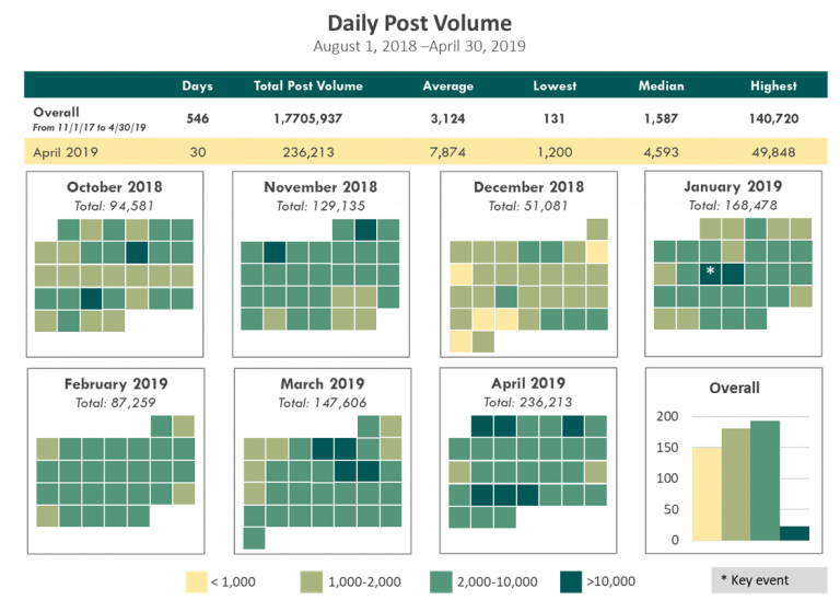
This high-level view is a calendar heatmap that shows the volume of daily social media posts. There is a histogram in the bottom-right that summarizes the social media activity for the entire time period. This presentation gives users an easy way to digest dozens of data points, quickly find days of high social media activity, and form an opinion about what a typical day of social media activity looks like.
YOY Comparisons in Social Media Activity
Excel, PowerPoint
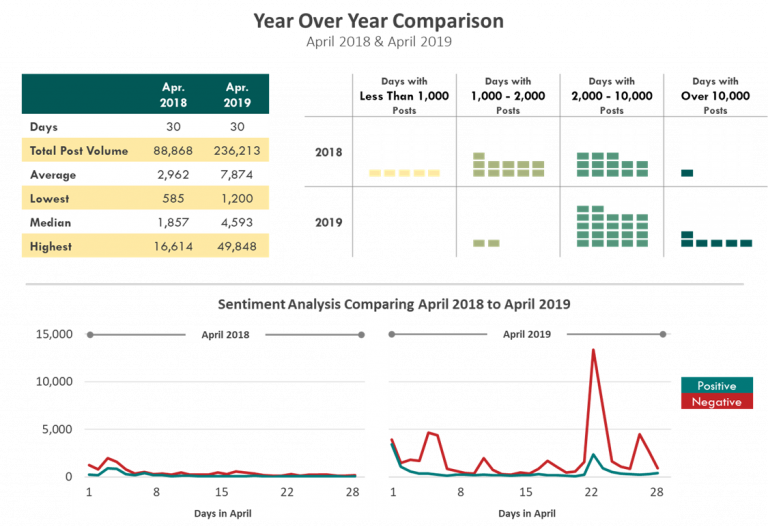
Year-over-year comparisons were key to this series because we were ramping up for the 2020 Census. While you may safely assume that there would be an uptick in online activity from 2018 to 2019, it was essential to quantify the increase. This gave stakeholders insight into the general public’s engagement. This engagement is explored even more with the sentiment analysis at the bottom. For the most part, positive and negative sentiments have a similar distribution but we do see a few striking spikes in negative opinions.
Monthly Sentiment Analysis of Social Media Activity
Excel, PowerPoint
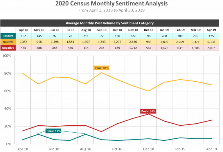
This is a drilled down view of the sentiment analysis on the previous visualization. At a glance, viewers can quickly see that overwhelmingly, the public’s opinion is neutral. You can also easily see that negative sentiment outpaces positivity for every month in the time series. The table at the top is great for users wanting exact figures and the line chart clearly shows trends in sentiment.
Moving Average of Social Media Sentiment Trends
Excel, PowerPoint
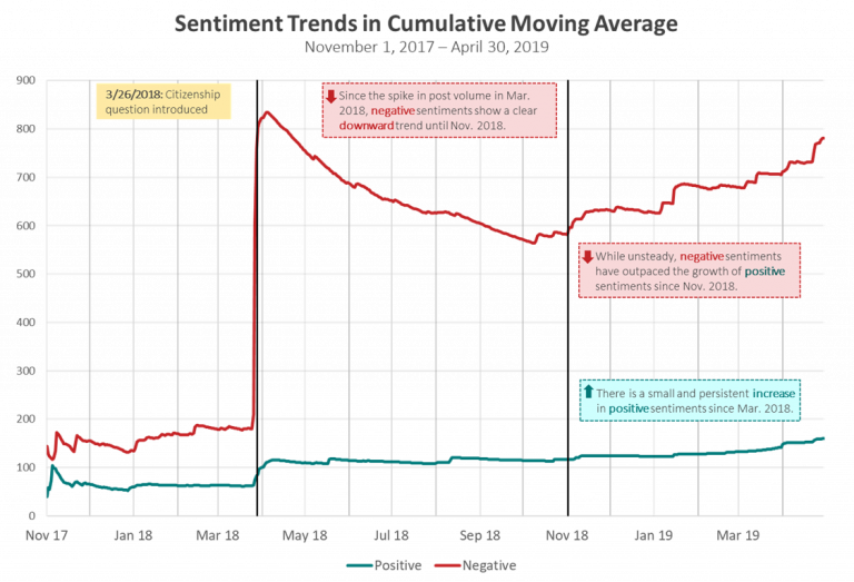
The big takeway message here is the annotation on the chart detailing when the citizenship question was introduced. That note provided valuable context understanding how people viewed the 2020 Census. Since I double as a data visualization expert and data analyst, I suggested using the cumulative moving average to understand sentiment trends. The cumulative moving average highlights that while negative sentiment is more common, the trend in negativity fluctuates. In contrast, positive attitudes towards the 2020 Census steadily increased as we got closer to the start date.
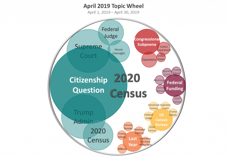
Topic Wheel for Social Media Posts about the 2020 Census
Excel, PowerPoint
The topic wheel was the only chart that provided enriched information about what people were saying about the 2020 Census. There were five major topics and each of them had several subtopics. This word cloud is ideal for getting the gist of online conversations. It helps viewers piece together what the prevailing opinions were of changes in policy and administration.